Lasting Impressions
Lithography as Art, Part 2
18 Jun 1988 – 6 Nov 1988
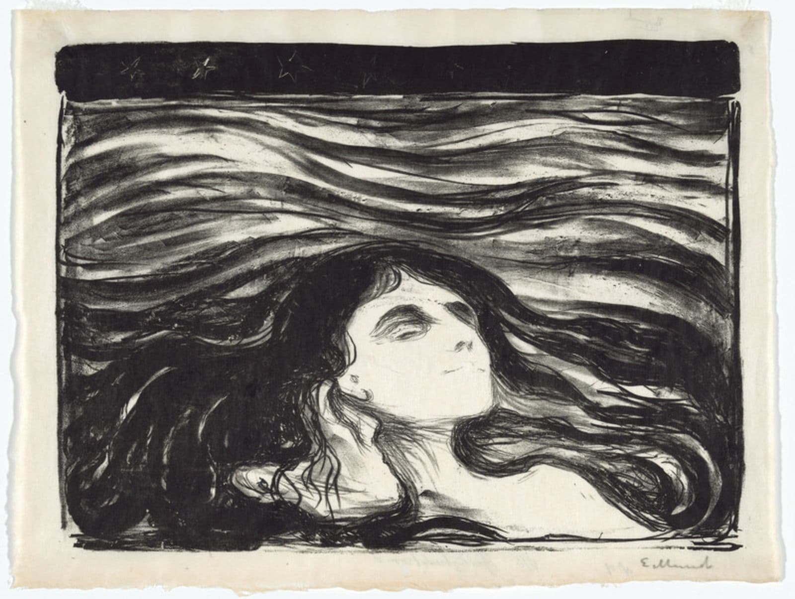
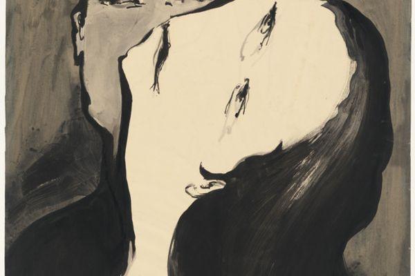
Edvard Munch, Auguste Clot, Meer der liebe [On the waves of love], 1896, National Gallery of Australia, Kamberri/Canberra, Purchased 1987.
Exhibition themes
Art and Commerce
Today, most of the printed material that finds its way into our bookshelves or onto our walls has been created lithographically. Since the beginning of the twentieth century the process has gradually overtaken letterpress printing as the dominant mass-production method. Although artists have made lithographs since the technique was discovered, its primary application has been commercial; it was used for music, maps and office circulars and was also employed to record people and places, to make satirical or political comment in the daily press, or to illustrate books. In the second half of the nineteenth century, production expanded to include greeting cards, postcards and eventually a flood of advertising. This burgeoning industry was largely served by pedestrian trade lithographers, who also earned their daily bread by copying paintings, although painters interested in graphic art were frequently involved. During the third quarter of the century gaudy commercial colour lithography — abusively termed 'chromolithography' by French and English connoisseurs — brought the cheapened process into disrepute, and the number of fine artists experimenting with it temporarily decreased.
As photography assumed the more mundane tasks, however, ‘originality' —which distinguishes a commercial print from one made by a fine artist for its own sake—was increasingly valued. While this resulted in the boundaries between original and reproductive work being rather too rigidly defined, more and more studios catered exclusively for artists as the process was mechanized. Already fascinated by the technique's limitless grey scale, ranging from palest silver-grey to velvet black, artists of the 1890s investigated the possibilities of colour. They learnt that lithographic ink did not have to be laboriously stippled by pen in the manner adopted by journeyman lithographers drawing to suit printing by machine, but, with specialized assistance, could be overprinted in nuanced washes which modified each other like transparent veils. After the second world war, lithographic technology arrived at a point where images could be produced on transparent film to be photo-chemically transferred to metal plates for printing by rotary offset methods. Such innovations have also been adapted for artistic use, although artists' printers have continued to preserve the exquisite qualities of drawing on stone pioneered in the early years of the nineteenth century.
The 1890s
The French poster-maker Jules Chéret introduced vibrant colour lithography into the public domain during the late 1880s, and overcame the snobbish resistance to it. Until then, colour lithographs had been considered the height of vulgarity and were specifically excluded from the various exhibiting salons. One by one, however, the outstanding painters of the day found their way to lithographic workshops. Three trial proofers from Lemercier and Company, the largest lithographic firm in Paris, became renowned as independent artists' printers. Despite superb skill, Henry Belfond went bankrupt when James McNeill Whistler was working with him on some delicate colour lithographs; E. Duchâtel wrote a celebrated manual in 1893 which passed on various tricks of the trade to artist-lithographers; Auguste Clot set up a studio in the rue du Cherche-Midi at which he worked with many leading artists of the day.
Clot worked for two of the most important publishers of the period — Ambroise Vollard and Gustave Pellet — and was particularly adept at processing and retouching colour washes. In an influential booklet entitled Original colour lithography, written by the critic André Mellerio, Clot was attacked for helping 'original' printmakers too much, and substituting his own judgement 'when their personality was not very strong or assertive'. In fact, surviving correspondence sent to Clot reveals that he simply did whatever the artists using his services requested. For the legendary sculptor Auguste Rodin he drew and printed exquisite facsimiles of watercolours, such as those illustrating Vollard's luxury volume Le Jardin des supplices. For Cézanne, who lithographed the keystones for his two celebrated pictures of bathers, Clot drew and printed the colours indicated by the artist on a watercoloured maquette. For Maurice Denis and Paul Signac, Clot would adjust colours by following notations on their working proofs. When the printer needed money in the lean years following the first world war, he sold a number of prints affectionately dedicated to him; one from Denis, now owned by the Australian National Gallery, is inscribed 'to M. Clot, souvenir of a laborious operation'. Some of Clot's most successful work is to be found in the portfolios of the 1890s by four members of the Nabis — Love by Denis, Landscapes and interiors by Édouard Vuillard. Some views of Paris life by Pierre Bonnard, and an unfinished suite of landscapes by Ker-Xavier Roussel.
At the turn of the century, the printer also helped Bonnard produce two of the most beautiful modern artists' books. Parallélement shocked bibliophiles with pink overflowing into the margins around the poems of Verlaine, while the classical text Daphnis and Chloe, although in its own way just as witty, was more formally arranged. While still in with Lernercier, Clot had pulled some famous monochrome prints for Édouard' Manet, and in all probability for Fanon-Lantour and Odilon Redon as well. Fantin and Redon kept lithography alive through the doldrums of the 1870s and 1880s, and when Clot set up on his own they worked with him as well as with several other printers. Although Redon took charge of his own monochrome prints, a letter from him reveals that the exquisite colour lithograph Béatrice of 1897 is actually a facsimile made by Clot after a pastel belonging to the publisher Vollard. Despite upholding the unalloyed purity of original prints, Mellerio, Who catalogued Redon 's lithographs, does not appear to have been aware of this fact.
Clot also worked with the great Norwegian artist Edvard Munch, who spent a year in Paris in 1896-97. Munch probably worked in the rue du Cherche-Midi at roughly the same time as Toulouse-Lautrec, for in that year the French artist is thought to have collaborated with Clot on Elles — the wonderful series of colour prints based on the lives of women in a Parisian brothel. Munch created a number of powerful black and white lithographs in Clot's workshop. Lovers in the waves and Attraction I reveal his rather pessimistic view of human relationships. Clot also taught him how to make woodcuts and after his return to Norway, Munch began to use woodcut and lithography together — a strategy that he almost certainly learnt by watching Clot combining the techniques in magazine images by Henri Héran.
Lithography was so popular by this time that Clot not only made limited edition prints for most of the leading artists, but despite running an unmechanized press, also pulled long runs for luxury journals like Pan. In 1907, for example, he produced a small colour image of Christ's nativity by Denis for the Gazette des beaux-arts; the edition of 1500 copies required 6000 passages through the press. Until his death in 1936, Clot continued to collaborate with such major artists as Henri Matisse, as well as Georges Rouault, whose lithographic masterpiece Autumn was made with Clot's assistance.
Lithography and Modernism
Lithography has lent itself to just about every 'ism' in the lexicon of modern art. Gauguin and Sérusier used it from 1889 for their newly formulated style known as Synthetism. Aman-Jean and Redon found it appropriate for the suggestive mystery of Symbolism, while Vuillard and his Nabi friends, including minor artists like Rippl-Rónaï, pictured quiet domestic scenes in a style that the critics dubbed Intimism.
By the turn of the century, the Post-impressionist passion for colour lithography seemed to have burnt itself out. This decline may have resulted from the satiation of the market, the new photomechanical relief processes or rapidly rising production costs. Moreover, early twentieth century artists inclined to other techniques: the Fauves (meaning 'wild beasts') tended to favour
broad tooling on wood, while the adherents of Cubism preferred the dry astringency of etching. Even so, the Fauve painters Maurice de Vlaminck and Raoul Dufy respectively made dashing colour landscapes and scintillating images of bathers. Similarly, Albert Gleizes and Alexander Archipenko provided quintessential Cubist lithographs for the German periodical Die Schaffenden. The founders and adherents of German Expressionism — Kirchner, Heckel, Schmidt-Rottluff, Pechstein, Mueller and Nolde — valued the immediacy of the process. Several of them printed their own chalk lithographs, unconventionally dissolving parts of the drawing with turpentine to create unusual washes, and often taking a novel monotype approach to colour. Max Ernst and Paul Klee, who were both interested in Surrealism, used various transfer methods to stimulate their imaginations.
Artists of many different nationalities, including the Russian Kandinsky, contributed to group albums for the famous German Bauhaus art school. Kandinsky favoured lithography's speed and unpretentiousness, which he regarded as having democratic potential. Other Russian artists, including Klutsis, Larionov, El Lissitzky and Malevich, used lithography to circulate information about the succession of developments they pioneered — Rayism, Suprematism and Constructivism. The Germans Baumeister and Schlemmer used precise lithographic drawing methods for schematic geometries based on the human figure, while George Grosz, fulminating against capitalist society, cared little for the concept of 'originality'. Grosz reproduced drawings photolithographically to make political points in various polemical newspapers. At the other end of the aesthetic spectrum, a form of linear Classicism was revived between the wars in some lyrical images by Derain and Picasso.
Despite this continuous trickle of artists' lithographs representing every aesthetic persuasion, it was only after the second world war, when colour was dominant again, that the level of production once more equalled that of the 1890s. This time, Fernand Mourlot and the clever lithographers of his Parisian atelier produced great quantities of posters, limited edition prints and books for the now popular painters of the School of Paris — Georges Braque, Pablo Picasso, Fernand Léger, Joan Miró and Marc Chagall. Many lesser known painters of the day were also urged by their dealers to give lithography a try.
Most artists worked in colour, but Picasso, despite an occasional flamboyant print like Figure in a striped bodice, worked largely in black and white. Drawing from dawn to dusk in a corner of the Mourlot workshop, he virtually reinvented lithography, amazing the printers with his virtuosity. News of his output, and that of his great contemporaries Braque and Chagall, spread like wild-fire through the English-speaking world. Entrepreneurs were inspired to set up collaborative workshops along the lines of the Mourlot atelier in countries where only commercial printers and art schools had previously offered lithographic opportunities.
In the late 1950s, for example, Stanley Jones, who had printed for the post-war Tachist generation in Paris, opened the Curwen Studio in London. Here, John Piper, working on A retrospect of churches, was one of his early customers. As a teacher at the Slade School, Jones taught lithography to Janet Dawson, a young Australian painter on a travelling scholarship from the National Gallery School in Melbourne. Later, in what was then an extremely unusual step for a woman, she became a printer in Paris. On her return to Australia, she broke with tradition by attesting to her industry with Big noise and a companion lithograph, rather than the expected painting. At a workshop opened in Melbourne by a commercial gallery, went on to help several other Australian artists make lithographs. Although lithography has never been a dominant technique in Australia, lithographs of distinction have been made by Noel Coulihan, Noela Hjorth, Leonard French, Charles Blackman and Lloyd Rees, and the process was recently adopted by England Bangala and other Aboriginal artists in a program run by Theo Tremblay at the Canberra School of Art.
Lithography in America
Even in a country as large as America there were few printers catering specially for arts. Jacob Kainen made a rare colour lithograph at a print workshop funded by the Government during the Depression and a portfolio of small black and white offset prints was produced by the American Abstract Artists' Association in 1937. Robert Riggs was able to find a sophisticated collaborator on the East coast for his realist images of people in hospital, while on the West coast Clinton Adams had his precisionist Second hand store editioned by another professional printer. Many artists, however, among them June Wayne, went to Europe to find the skills they needed. In 1959-60, Wayne and Adams, fearful that lithography would die out in the United States, set up the Tamarind Lithography Workshop in Los Angeles. By training printers and introducing the technique to artists of great stylistic diversity, Tamarind created greater possibilities for artists' lithography than the world had ever seen. In 1983, when the Print Collector's Newsletter published a register of workshops in the United States, it listed ninety-five establishments offering lithographic facilities. This expertise has also spread elsewhere, so that most countries can now boast their own Tamarind-trained lithographer.
The prints that emerge from the lithographic presses are bewilderingly varied. Even in the work of a single artist, such as David Hockney, the manner of drawing can range from the almost nineteenth-century delicacy of Celia smoking to his much more coarsely drawn portrait depicting the printer Ken Tyler from several points of view. Photolithography has been accepted into the canon of 'originality', as witnessed by the abstract arrangements of photographic fragments in Robert Rauschenberg's Rookery mounds, or the images manipulated by Eugene Feldman, a commercial printer who would play with his huge lithographic offset press after finishing the day's work.
In the pluralist output of the post-war world, lithography has served artists as varied as Josef Albers and Adja Yunkers, Enzo Cucci and Vasarely, Vija Celmins and Frank Stella, Willem de Kooning and Joel Shapiro, Philip Pearlstein and Richard Serra. From precision geometry to objective drawing, from abstract gesture to photorealist minutiae, from optical complexity to Neo-expressionist fervour, from the uncompromising minimalist statement to the deadpan humour of Pop, lithography continues to prove itself equal to whatever aesthetic demands contemporary artists place on it.
Pat Gilmour

