The Big Americans
Albers, Frankenthaler, Hockney, Johns, Lichtenstein, Motherwell, Rauschenberg, and Stella
4 Oct 2002 – 27 Jan 2003

Frank Stella, Flin Flon, 1970, purchased through the NGA Foundation with the assistance of Terrey and Anne Arcus and Penelope and Harry Seidler 2002 © Frank Stella. ARS/Copyright Agency
About
The genesis of our world-class contemporary international print collection took place in 1973, almost a decade before the National Gallery of Australia opened to the public. Following the recommendation of art critic and writer Robert Hughes to the Master Printer, Kenneth Tyler, that he approach the fledgling Gallery, great riches arrived. In a recent significant gift and purchase this initial acquisition has been augmented to form an extra-ordinary storehouse of major works by major artists of the contemporary period produced at the Tyler workshops from the 1960s to the present day. A selection is featured in the exhibition The Big Americans: Albers, Frankenthaler, Hockney, Johns, Lichtenstein, Motherwell, Rauschenberg and Stella, at the Gallery from 4 October 2002 to 27 January 2003. The Big Americans explores the different ways in which these artists each worked at the world renowned Tyler studios, and includes major works from the Gallery's rich collection of editioned original prints, screens, paperworks, illustrated books and multiples, along with rare or unique proofs and drawings.
Each artist - Josef Albers, Helen Frankenthaler, David Hockney, Jasper Johns, Roy Lichtenstein, Robert Motherwell, Robert Rauschenberg and Frank Stella - is noted for their significant output in other media. For this reason, a selection of key related paintings, sculptures and photographs is included in the exhibition drawn from International and Australian collections.
In 1965 Ken Tyler established his print workshop Gemini Ltd in Los Angeles. This later became Gemini GEL [Graphic Editions Limited] - known as the 'Metro-Goldwyn-Mayer of print workshops'. Gemini GEL achieved its reputation as a result of Tyler's commitment to his artists, he said to them 'here is a workshop, there are no rules, no restrictions, do what you want to do'. Tyler explains that when it comes to printmaking, 'if you have all these "can'ts" in there you change the nature of creativity'. He continued with this philosophy at his later studios, first at Bedford and then at the purpose-built workshop at Mount Kisco - both in New York State on the East Coast of America.
From the start, Tyler wanted 'to go to the very top' and sought to collaborate with some of the postwar greats in the American art scene. He first set his sights on émigré artist, Josef Albers - an artist obsessed with form and colour since his Bauhaus days. Together they produced the seminal series White Line Squares, which became Tyler's calling card - he took the set when he visited other artists on his wish list, saying 'if I could do that for Albers, just think how far I could go for you'. For Tyler, White Line Squares were the 'first notes on the piano', and what followed a 'symphony'. It is this 'symphony' of extraordinary innovation, scale and technical virtuosity, which is the subject of The Big Americans.
Many of the great artists of the time were seduced by what was on offer to them and were pleased to spend time in an environment of unlimited possi-bilities. The consummate draughtsman David Hockney, for example, was given a 'complete palette of colour' and a 'complete palette of drawing techniques' - something Hockney had never been offered so comprehensively before.
Two other pre-eminent artists who were enticed into the studio were Robert Rauschenberg and Jasper Johns. Rauschenberg, according to Tyler, was not impressed by the technical facilities - for him, the printing press was 'just a device'. Instead Rauschenberg created an intimate space in the studio, focusing on the rich possibilities of Tyler's treasured lithographic stones. These surfaces, or 'skin' as the artist called them, were sensual, 'sexy' objects to draw on, to experiment with. Scale seemed limitless and Rauschenberg produced ground-breaking art, mixing different techniques and photocollage. Jasper Johns also came to work on Tyler's 'gorgeous' stones, which had been ferreted out by Tyler from an old building site and carted to his studio in an old VW with broken springs. Johns's lusciously coloured numbers such as Figure 7 1969 with its smiling Mona Lisa were created from one such favoured stone.
Pop artist Roy Lichtenstein came to see the possibilities and produced such masterpieces as the print and sculpture series Peace Through Chemistry at Gemini GEL in 1970. With its deadpan, meaningless title, this was a spoof on modern art. Equally witty is Lichtenstein's Reflections series made at Tyler Graphics some 20 years later in which the artist reinterprets and refines his earlier paintings and prints drawn from cartoon, romance and war comics or from other artists' work. Included in this is Swee'-pea - the offspring of Popeye and Olive Oyl - its howling face reminiscent of the expressionist painting Scream by Edvard Munch.
After moving to Bedford, Tyler developed a close personal and working relationship with Robert Motherwell, whom he had also worked with in his Gemini days. Producing 'painterly prints' for major abstract painters such as Motherwell as well as Helen Frankenthaler was an incredible challenge. Both artists worked in an intuitive 'automatic' manner and, while their work was redolent of a whole repertoire of art imagery from the past, each maintained a 'freshness of expression' despite the rigours of technical production.
The collaboration between Tyler and the foremost American abstract artist, Frank Stella, was once described as 'part brinkmanship, engineering, and some-times theater'. Robert Hughes views it as 'one of the great partnerships in modern American art'. Over the years Stella and Tyler have refined their unique process of working from a completed collage, adopting a wide range of printing techniques for the one work, and editioning on specially made paper. 'Frank the scavenger', as Tyler calls him, creates the compositions from the 'debris d'atelier' (studio debris), which means past imagery from Tyler's 'supply center, a living inventory, a library of shapes and images' is recycled as the source material for Stella's painting and sculptures, then back into printmaking, resulting in the extraordinary, ambitious works for which he has become renowned. Examples of Stella's work in two and three dimensions feature in The Big Americans.
Complementing The Big Americans, a program of public lectures and master-class workshops with Ken Tyler and visiting artists will be held in Canberra at the National Gallery of Australia, the Australian National University, and the Canberra School of Art, and in Melbourne at the Australian Print Workshop. The master-classes will provide an important opportunity for Australian artists and students to work with master printmaker Ken Tyler.
Jane Kinsman
Themes
The Art of Seduction
Josef Albers
Soon after the establishment of Gemini GEL in January 1966, Tyler contacted Albers, proposing that they work together on a series of lithographs - which became the seminal White Line Squares.
The series was initially produced as two sets of eight colour lithographs, with a subsequent 17th print. Both series were issued in 1966. The series became the visual expression of Albers' thesis:
A white line within a color area instead of as a contour may present a newly discovered effect: When the line is placed within a so-called 'Middle' color, even when the color is very evenly applied, it will make the one color look like two different shades or tints of that color. 1
The result is the appearance of four colours, despite the use of only three inks.
Initially, Albers had been sceptical about using lithography; he believed the process could not match the luminosity that he achieved in his painting series Homage to the Square. These paintings, which he began in 1950 and continued to work on obsessively for the rest of his life, consisted of what Albers called 'platters to serve color' - in different combinations, because of their interactions, the colours would have different 'readings'.
After a lifetime of honing his sense of colour, Albers had an extraordinary sensitivity to its subtleties. He demanded and received perfect colour matching, which was essential for the success of this and other print projects. The artist would bring a leaf or a twig and ask Tyler to replicate the colour exactly in ink. After making many proofs in the new intimate premises, with a small staff, their first joint effort in screenprinting at Bedford Village was Gray Instrumentation I in 1974 and Gray Instrumentation II the following year (two of four portfolios). Such precision in screenprinting had not been seen before. With Tyler, Albers produced these remarkable works shortly before he died in 1976.
Robert Rauschenberg
For Rauschenberg, Tyler promised that scale was not a problem. He decided to make a life-sized self-portrait and promptly took himself off to the Kaiser Medical Group where he had himself X-rayed in the nude, except for a pair of large boots. This X-ray became the key element for the print, Booster 1967. Photographic elements, the artist's drawing and some rubbings helped to complete the image. What was also notable about Booster was the combination of the different techniques of lithography and screen-printing on mould-made paper.
Booster became a key stepping stone in the history of postwar American printmaking, where limits to imagination and scale were discarded. It remains one of the most significant prints made in the twentieth century, helping to bring printmaking into a new era in which prints were to rival paintings in invention and size.
Rauschenberg's next project with Gemini GEL was a revolutionary print series, Stoned Moon of 1969-70, in which the artist's aspirations and inspirations were matched by the skill and inventiveness of Tyler and the workshop team. Rauschenberg had been invited by NASA (the National Aeronautic and Space Administration) to witness the launch from the Kennedy Space Centre, Florida, of the rocket that would land a man on the moon. The artist was then commissioned by Gemini to make a series of prints drawing on this experience.
Aside from the originality of the concept of the Stoned Moon series, these prints required technical inventiveness and resourcefulness; and the scale of several of the works, including Sky Garden, had implications for the future history of collaborative printmaking. 'We kept increasing in scale', Tyler noted, 'not just because we wanted to, but the artists were actually asking for it.'
Pages and Fuses of 1973–74 consists of a series of 12 paper works The Pages were delicately shaped works in combinations of pulp - made of natural coloured rag with additions of cords, cloth remnants and cloth tape. For Fuses Rauschenberg incorporated combinations of brilliantly coloured inked pulp, collaged with screenprinted tissue, to form unusual shapes such as can be seen in Link of 1974 - a twentieth-century version of a luminous medieval manuscript. This venture heralded the future of handmade paper in the Tyler workshops.
Jasper Johns
Jasper Johns selected all the large stones and, treasuring their quality and feel, started drawing on every one of them, making a series of numerals that were printed in black, using the limestone surfaces to great advantage.
Having printed the black numerals, Johns turned his attention to printing a coloured series from the same stones as the first, but with colour rainbow rolls - the stone inked with a roller loaded with several coloured inks. Printing two editions from the same stones could have been a difficult undertaking because an image can become degraded with use, so Tyler turned to a technique he had learned at Tamarind in 1963, which he had been taught by Marcel Durassier - he described it as a 'rub up technique',
It was a very elaborate way of capturing all the nuances of a wash that an artist applies to a stone. But it also puts [the printing surface] into slight relief. In the planographic medium of lithography, there really isn't any raised surface. It's chemical, it's flat, it is difficult to maintain, difficult to stabilise. But with Marcel's technique, with a little innovation here and there, I was able to create this very low relief that would sustain very long printings.2
Tyler successfully editioned the ten black numerals followed by the colour numerals, along with many proofs. The result includes lusciously coloured numbers such as Figure 7 1969 - with its image of a smiling Mona Lisa, and the artist's handprint.
Transforming the trite into beautifully wrought works of art in painting, printmaking and sculpture brought Johns to prominence during the Pop Art era.
Johns appropriated and refined his own work constantly. His first Toothbrush of 1959 was a cast sculpmetal version of this prosaic object, with the bristles replaced by teeth.
This image of the toothbrush was to reappear, including a relief sculpture Johns made with Tyler in 1969, The Critic Smiles, with the image moulded in wax and plaster, then embossed into sheet lead. The teeth were cast in gold by a dentist then set on the brush, which was leafed in tin. For this 1969 series of five reliefs, including the toothbrush, Johns revisted previous subject matter, including a shoe with a mirror; a flag; a light bulb; and a slice of bread. The original intention was that these compositions should be made in the form of embossed paper, using a hydraulic Hoe platen press at the Amsco Corporation. This failed because the press tore the paper. Tyler then suggested the hardier sheet lead.3
Typewriter Pointillism: Roy Lichtenstein
Kitchen Stove
Lichtenstein developed an original aesthetic during the early 1960s that paradoxically highlighted industrial printing methods derived from his sources of inspiration. He adopted the subject matter of popular culture, of action movies and comics, romantic potboilers, advertisements, manufactured objects and items of food, such as in his paintings Kitchen Stove of 1961-62 and Peanut Butter Cup of 1962. These were rendered to achieve a mechanical look using the Ben Day dot system - a commercial printing technique used to denote halftones, named after the American illustrator Benjamin Day. On the side of the stove, for example, the eye mixes the colour of the dots (blue) and the colour of the background (white), which gives the appearance of a lighter blue. Lichtenstein's marriage of commercial subject matter with a masterful technique produced a double-edged art characterised by a keen wit and a sardonic style.
Cathedral 4
The Monet prints of 1969 were the first works Lichtenstein made at Gemini GEL. On one level, the Cathedral and Haystack prints can be interpreted as following Monet's exploration of light and the passage of time. In Lichtenstein's words, they are 'supposed to be times of day'
The prints are also about looking. The combinations of colours, the motif and the dot screens provide for a range of viewing effects. The motif may appear to dissolve before the viewer's eyes, aided by the fact that, unlike so many of Lichtenstein's cartoon-inspired images, his Monet series of prints lacks the heavy outline in black used to define previous subjects.
Peace Through Chemistry I
Lichtenstein's next print series, made with Tyler in 1970, was Peace Through Chemistry, a group of five prints using lithography and screenprinting - sometimes in concert, sometimes separately - and one relief. The artist described the imagery as 'muralesque' - 'they are a little like WPA murals'.4 Each composition consists of a head in profile, with chemistry paraphernalia and a machine-like, Art Deco look.
All the works relate to earlier iconography of the mid- to late sixties, such as that seen in his 1965 Castelli poster This Must be The Place, or his poster for the film festival at the Lincoln Center the following year. The poster had a similar thirties look.5 These works were stepping stones that took the artist towards Peace Through Chemistry.
Reflections on The Scream
The Reflections prints were so large and complex that the various processes were pushed to the very limit, while demanding that the printer achieve perfect registration and keep the paper, with all its collage and embossing, intact. The series was important for the development of Lichtenstein's subject matter, for it showed the artist contemplating what he once considered the anti-contemplative nature of his early work.
The Reflections reinterpret and refine the earlier paintings and prints drawn from cartoons, romance and war comics or from other artists' work. In Lichtenstein's re-examination of the art of the past in Reflections on The Scream, we see the cartoon character of baby Swee'-pea - the offspring of Popeye and Olive Oyl - whose howling face refers to the Expressionist painting The Scream by Edvard Munch.
Nude With Blue Hair
For Nude with Yellow Pillow, Nude with Blue Hair and Roommates of 1994, Lichtenstein reinterpreted the type of comic strip imagery he first used in the 1960s
The Nudes, like the series Reflections, are key examples of Lichtenstein's late Pop Art style, which emerged in the 1990s. This style was one of great complexity and refinement, but one which also alluded to his past. Although he returned to the imagery in his scrapbooks of teen romances and war comics, he transformed it. The bathing beauties who populated the DC comic books are now nude and set in pastiches of earlier iconography - the everyday objects, the interiors and scenes drawn from advertisements. The artist executed these compositions in a lightened palette and with his ever-present sardonic wit.
A Moving Focus: David Hockney
Picture of Melrose Avenue in an Ornate Gold Frame
The first group of prints Tyler and Hockney made together was a set of six colour lithographs, A Hollywood Collection 1965, at the Gemini Ltd workshop on Melrose Avenue in Los Angeles
A Hollywood Collection is a witty group of compositions in bold colours not seen before in Hockney's printmaking. The combination of bright colour and the mixture of flat and rounded forms owes something to his painting style, since he began painting in synthetic polymer paint after he moved to Los Angeles. Each print is in the form of a different genre of painting - a still life, a landscape, a portrait, a cityscape, a nude and an abstract - an instant art collection. The genres are also shown in a variety of styles, from a Cubist variation and an abstract form, to a figure drawn in a manner recollecting the naïve drawing of Dubuffet (an early influence on Hockney) and so on. One has a painterly tree set against a flat sky; another has a painterly sky, with the stark flat form of a building in the foreground.
Despite the melange of styles, these compositions were nevertheless unified. As part of the composition Hockney 'framed' each work with a different design, ranging from the ornamental to a more simple modernist frame. These witty inclusions were inspired by his workplace surroundings: 'Gemini … was behind a frame-maker's shop, and that's why I did the frames as part of the prints.'6
Rain
Hockney became set on the idea of a weather series, beginning with Rain, a print inspired by Japanese woodcuts
To create this colour lithograph Rain, from the Weather series, Hockney dripped ink onto a lithographic stone. In the documentary film Reaching Out, he commented: 'I did it kind of as a joke really. I loved the idea of the rain as it hit the ink. It would make the ink run. The moment I thought of the idea I couldn't resist it.' He then turned his attention to other ideas relating to the weather theme, inventing the series as he proceeded, and drawing on the Japanese ukiyo-e print imagery of such artists as Hokusai and Hiroshige.
Celia Smoking
Following the Weather series, Hockney turned to portraiture. This superb draughtsman is noted for his sensitive, beautifully rendered portraits of lovers, family and friends. Rarely does he make portraits of those he has not met before.
The range and subtlety of the washes he could achieve at the workshop were of a kind that Hockney had never been offered before, and drawing directly onto the stone or plate suited him. Hockney felt secure that the quality of his drawing would not be lost: Tyler would 'make sure everything you put there stays there, which is not that easy, especially if you've used delicate washes, thin crayon, things like that'.
A Diver Paper Pool 17
On a visit in 1978, Hockney saw the works made of paper pulp by Ellsworth Kelly and Kenneth Noland and thought them 'stunningly beautiful … especially Ellsworth Kelly's'.7 He decided to stay for a few days, curious about the possibilities of paper pulp.
As the days at Bedford passed, Hockney allowed the process to lead him into new avenues. In the end the artist stayed for 49 days, working 16 hours a day with just one day off (Tyler counted the days, Hockney did not). From August to October of 1978, Hockney made a series of 29 paper works with Tyler and assistant Lindsay Green. The subject became the swimming pool.
The pool, the light and shadows on the water, the steps, and the diving board, and later with the effect on it of different times of day and seasonal changes were all examined by Hockney in these changing circumstances just as Claude Monet had done nearly a century before. To assist his process, Hockney took multiple polaroids of the subject, as well as drawing it. He stopped considering papermaking as a graphic medium and began to 'paint' with colour paper pulp, using galvanised cookie cutter moulds to make the shapes, and turkey basters and other implements such as spoons to poor or squirt on the dye. The sheet would be half pressed, squeezing out some of the water and leaving it moist, so that Hockney could add further colour, enlivening the work. He would dart back and forth like a painter touching up a canvas.
Hotel Acatalan: Two Weeks Later
In February 1984, on the way from Mexico City to Oaxaca, the artist's car broke down and Hockney, with Gregory Evans and David Graves were stranded in the little town of Acatlán. There they stayed at the Hotel Romano Angeles while repairs were under way. The artist was captivated by the hotel and its garden:
On his return to Los Angeles, Hockney spoke to Tyler about his Mexican experience, and Tyler saw this as an opportunity to work outside the confines of a studio. Mylar was used as the drawing surface, from which the image could be then be directly transferred to a photosensitive lithographic plate. Hockney enthusias-tically embraced it, as Tyler recalls:
It was to be a perfect technique for Hockney, as the artist was adept at thinking in layers and warmed to experimentation. The transparent nature of mylar allowed him to view all the different coloured marks on the combined sheets at one glance.
The Moving Focus series also stands as an important investigation into ideas about representing space and time. As Hockney explained: 'In these prints there is no way to see what is depicted all at once.'
Your eyes have to move over the surface of the paper. In doing that you're very aware that you keep moving from one thing to another and in your mind you convert that time to space … Space can be made into time. That's the way space is created in these pictures, because there's many perspectives. If there's only one-point perspective, there's only one moment in time. That's why it restricts space, because one moment in time has put a boundary on space.8
The Painterly Print: Robert Motherwell
America-La France Variation I
A method favoured by Motherwell was collage, which he considered as an equivalent to a modern still life; and his collage work serves as a journal outlining his development. But collage had its difficulties too.
The problem is, given these disparate and conflicting elements, how ultimately to unify them. It's a painful and precarious way of making order. The separate elements tend to carry on guerrilla warfare with each other, a source of tension, true, but also possibly of chaos. Nevertheless Motherwell rated collage methods highly.
Motherwell's collage prints, such as the America-La France Variations series of 1983–84 (named after the company that made American fire engines, rather than being the artist's salute to the culture of France) reveals the multiple changes each image underwent over time. The nine prints and multiple progressive proofs attest the painstaking process he undertook.
St Michael III
Tyler was keen for Motherwell to work on a large scale, but the artist continued making small prints. He was a chain smoker and made use of cigarette boxes for his collages, just as they appeared in the French Cubists' works on café life. To encourage him to think about a larger scale, Tyler took one of the cigarette collages, enlarged it and printed it. The exercise worked and Motherwell incorporated this in a large collage print. Editioned prints of Bastos of 1974–75 and the St Michael series of 1975-79 ensued, which combined the torn cigarette box elements with gestural sweeps in a powerful and dramatic large-scale form.
Blue Elegy
One way Motherwell responded to the challenge of establishing a truly American art was by developing archetypal imagery. From 1948, he began his Elegies to the Spanish Republic, first in painting and later in printmaking. The images, evoking the tragic past, and the defeat of the democratically elected Republicans by the Monarchists in the 1930s civil war in his much-loved Spain, would stay with him for his lifetime.
The final group of works Motherwell made with Tyler reflects this changing interest and the printer's keenness for this to happen. That group includes Blue Elegy 1987and Mediterranean Light of 1991, which combine lithography and colour pressed paper pulp, providing a richness and a saturation of colour not achieved before by this artist.
A Matter of Translation: Helen Frankethaler
Gateway (screen)
The idea for Frankenthaler's masterpiece Gateway (screen) took many years to evolve. In 1982 she had begun work on a colour intaglio and relief print on three sheets, Gateway, which was editioned in 1988.
Working with the lost-wax casting process, to produce parts of the frame of the editioned version of the screen, appealed to Frankenthaler. At the suggestion of the owner of the foundry, she used sand-blasted bronze plates, which formed the back of the screen. These she painted individually with acids, to produce ravishing bronze surfaces with patinas of extraordinary beauty. The editioned intaglio print, Gateway, was placed on the front of the screen. In all of Frankenthaler's work with Tyler this was a unique collaboration.
Tales of Genji III
Tyler's collaboration with this demanding artist was at its closest and most radical during the making of the Tales of Genji series of prints. By this stage in her career, in the 1990s, Frankenthaler was keen to translate to printmaking the spontaneity and gestural qualities of painting. And it was a particular challenge for Tyler to offer the consummate printmaker something new in the field of the woodcut. He suggested that she begin by painting some carefully selected woods, and provided her with a range of brushes and sponges to experiment with. After painting several panels, she chose six exquisite examples, which became the studies for this series of prints.
A Print Epic: Frank Stella
Flin Flon
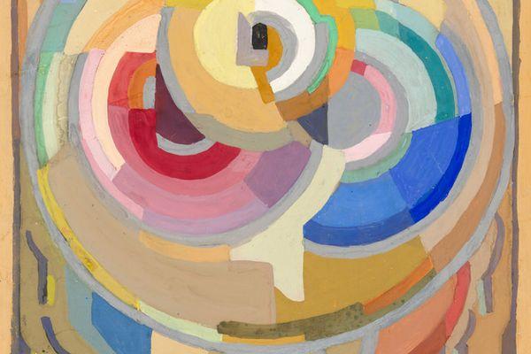
In 1967 Stella began a series of Protractor paintings, notable for their bold curvilinear forms, large scale and vivid colour. He developed a variant of these compositions, which he enclosed in a square - such as Flin Flon of 1970. Painted in brilliant pigments in polymer and fluorescent paints, the symmetrical compositions and formal, organic shapes evoke Islamic pattern - something Stella was interested in at that time.
Pergusa Three
The series Circuits of 1982-84, were printed from a combination of etched magnesium plates and woodblocks. The prints were named after motor racing tracks, for example the Imola prints (after the course in Italy) and the Pergusa prints (after the Sicilian track). Their compositions hark back to Abstract Expressionism, particularly the art of Jackson Pollock.
Juam
Juam is one of two from the Imaginary places series of 1997 (the other being Juam, State I) that refer to another of Melville's novels, Mardi, originally published in 1849. Juam is a mythical island with rivulets, greenery and singing birds, and a magical palace, the House of Morning, which took five hundred moons to complete.
Juam continues the further exploration of the third dimension in printmaking, with a rich sculptural quality derived from the method of its making. The printing elements for Juam consist of a carved plywood substrate with 102 irregularly shaped elements - one honeycomb aluminium; 39 copper and 12 magnesium plates; one bronze, 11 poured aluminium and 16 brass elements; and 22 aluminium rings. This collage of poured metal, of wonderfully irregular shapes and forms, was then inked with 144 colours, taking printmaking to yet another high point of excellence.
