Ken Tyler
Printer Extraordinary
6 Jun 1985 – 13 Oct 1985
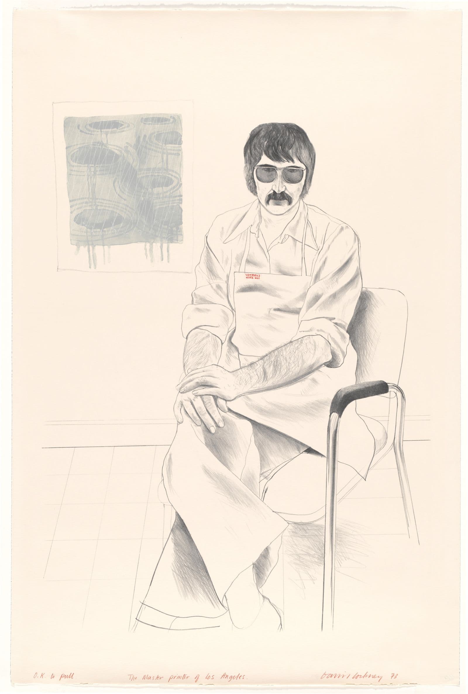
David Hockney, Gemini G.E.L., The master printer of Los Angeles, 1973, National Gallery of Australia, Kamberri/Canberra, Purchased 1973. © David Hockney.
About
In the course of the past two decades, Ken Tyler, founder of two major graphic workshops, has become one of America's greatest printers. His career has coincided with a remarkable flowering of American graphic art.
In the 1940s and 1950s, the majority of American printmakers worked in etching or woodcut and lithographs were, for the most part, small black and white pictures selling for around $5. June Wayne, who in 1960 created the Tamarind Lithography Workshop in Los Angeles where Ken Tyler studied to become a printer, has said that some of these lithographs were made so poorly, she used to 'pick them up like dead mice'.
Contemporary developments began with a renaissance in lithography — the technique in which Tyler was trained. Today, prints often combine all media and Tyler has become a particularly brilliant example of a new breed of highly skilled collaborator, able to offer artists any process and to assist them in making works of graphic art that they would have been unable to achieve on their own.
Prints are now a major art form with a potential as great as painting or sculpture. Pergusa three double, for example, produced by Tyler in 1984 for Frank Stella, was the culmination of a three year period of continuous work. This large-scale image, last in a sequence of many similar prints, retailed at $30,000 when it was first issued.
The content on this page has been sourced from: Ken Tyler, Printer Extraordinary : Galleries 8 and 11A, 6 June to 13 October 1985 / Australian National Gallery. Canberra: Australian National Gallery, 1985.
The background to Tyler's career
Although lithographs have been made in America throughout the twentieth century, by the late 1950s only one or two professional printers were still working and, because of the unpredictability of lithographic washes, they were encouraging artists to work mainly in crayon techniques. June Wayne, who was interested in experimental work, realized that in order to implement her ideas she would have to find a European printer. Frustrated by this situation she suggested to the Ford Foundation that instead of giving individual grants to artists, it should underwrite the resuscitation of the art of lithography in America. When she was invited to put forward a proposal, she did so as a conceptual exercise. To her surprise, the Foundation told her that it would back the project if she agreed to run it and she took up the challenge because of her love for the ailing process.
By 1970, the Lithography Workshop she founded helped to transform attitudes to printmaking throughout America, not least by focusing on the role of the printer and presenting it as a real and important vocation. June Wayne's plan consisted in inviting artists representing the complete aesthetic spectrum to collaborate with trainee printers. She also undertook an ambitious programme of research and development.
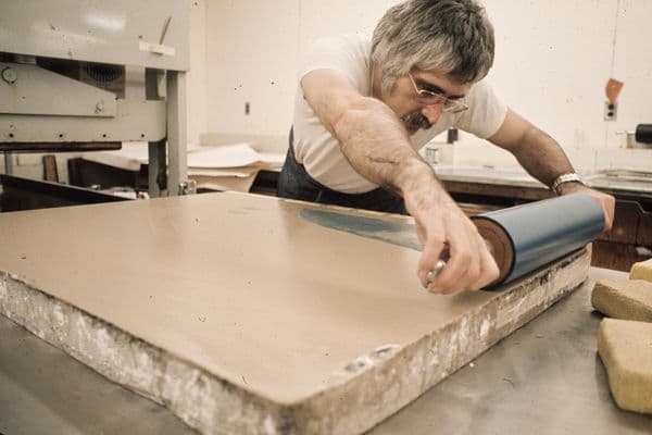
Tyler had learned the fairly restricted form of lithography typical of the time at the Art Institute of Chicago. In 1963 he took up the process again whilst studying for a Master's degree at the John Herron School of Art in Indianapolis. Here, Garo Antreasian, who had been Tamarind's first master-printer, became Tyler's teacher. Antreasian, whose large prints were exceptional for their time and excited Tylers imagination, recommended his student for a Ford Foundation Fellowship to the Workshop. Since by this time Tyler realized he was never happier than when he was using his hands, he went to Los Angeles.
He thus became one of eighteen master-printers to emerge from Tamarind during its first decade and in the opinion of Life magazine was the Workshop's 'most successful alumnus'. While he was at Tamarind, Tyler enjoyed a month's tuition with the French master-printer Marcel Durassier. At the end of their association, Durassier, impressed by the ability of his student, ceremonially presented him with his roller in a way Tyler describes as 'almost like a religious laying on of hands'.
Although he is well aware that Tamarind gave him his start and that the career he forged could not have existed without it, there were aspects of the Workshop against which Tyler reacted. For example, artists had to draw their own stones or plates which were then printed on direct presses; photomechanical offset techniques were not provided for. This was because the Workshop's founder believed it essential to focus her programme, for, while offset — the dominant commercial process — was in no danger of disappearing, the materials and skills for autographic techniques were near to total extinction. Tyler had accurately sensed, however, that the artists of the 1960s were making a major assault on existing conventions. The hard-edged flat colours and photographic images they had introduced into their work often made their ideas incompatible with the practices of the hand printing crafts. Consequently, when he began his own company, Tyler did so in the belief that craftsmen working in a society based on technology and automation had to capitalize on new materials and techniques. As one writer put it, with his 'future-oriented industrial aesthetic' Tyler 'Americanized the concept of the artisan printer’.
Josef Albers at Gemini
In 1965, Tyler set up his first workshop— Gemini Ltd. — at 8221 Melrose Avenue, Los Angeles. He adopted as his printer's chop, or identification mark, the zodiac sign for the heavenly twins, to symbolize the water and grease in lithography and the artist and the printer in collaboration. The motif was also associated with the American aerospace programme, in connection with which the most futuristic technology in the world was unfolding.
In Gemini's first year, Tyler did custom work for other publishers, but in 1966, intent on going into publishing himself, he formed a new company with two partners who provided capital. His existing Company was renamed Gemini G.E.L (Graphic Editions Limited). Its first publication was of the work of Josef Albers who had been among Tyler's most important influences at Tamarind.
Albers had been both student and master at the famous German design school, the Bauhaus, between the wars. He opposed the belief that the handmade was necessarily better than the machine-made, or that a mechanical construction was anti-graphic or unable to arouse emotion. 'In this age of industrial evolution', the artist said in 1961, 'both methods have their merits'.
At Tamarind, Tyler had worked on two portfolios for Albers that embodied this philosophy. To print squares within squares for Albers required infinite patience— the artist was such a perfectionist that to obtain the particular colour he desired might mean mixing thirty-five different blues only to discard them all. 'l accepted it as a challenge ... I adored the activity', Tyler said. June Wayne and Clinton Adams, who together ran Tamarind, agree that Tyler was the perfect printer for Albers and that the suites Day and night and Midnight and Noon 'moved lithography ahead'. Albers, too, realized he had found an outstanding collaborator. Because both suites consisted of perfect geometrical figures and absolutely flat colour, Tyler, contrary to normal practice, was allowed to draw the plates for the artist. Normally the code of original printmaking requires an artist to do all the work on the plate, but, as Albers later acknowledged, the Executive Secretary of the Print Council of America had not liked it when he had confessed that: 'l never touch the stone, never the rule, never the ink, it's all done by my friend Ken, but I watch him like Hell...’
When Tyler set up in his own business, Albers not only agreed to make prints with the new company, but donated to it, as working capital, four fifths of the profits from his seventeen White line squares. This suite required such technical precision for its expression that Albers would have been quite unable to paint its equivalent by hand. While squares within squares look simplicity itself, there is nothing in the world more difficult to print than a precise area of uninflected colour; it requires the dedication of a printer who perpetually practises his craft. What made the White Line Squares much harder to achieve than the Tamarind prints (which were difficult enough) was the fact that colours had to be abutted without overlap. The theory behind the suite, inspired by Albers' extensive work on the relativity of colour, was that if one of three interlocking colour areas is divided by a fine white line, it produces an illusion of two colours making a total percept of four. 'It's so exciting', enthused Albers when he saw some of the early proofs. 'Colour fools you all the time.'
Few people know that when Tyler tackled this most challenging and demanding work he was suffering from a back injury so severe that he had to wear a steel corset. Only seven months after setting up his first shop, he had hurt himself so seriously that he was obliged to spend almost a month in hospital. He kept this fact secret because he was afraid that if he revealed his physical incapacity, it would put his new business in jeopardy. The courage he displayed in the face of this disability makes his subsequent achievements the more remarkable.
The suites Tyler made for Albers at Gemini were supervised long distance by way of letters and charts sent from Tyler on the west coast to Albers on the east. Frequent telephone conversations were tape-recorded and survive in transcript. This was done partly to bolster the spirits of the printers, among whom Tyler noticed a high 'psychological fallout'. Although the so-called 'industrial aesthetic' of the prints is not as machine-made and unemotional as is sometimes claimed, the printers, Bernard Bleha and Jim Webb, were initially alienated by the honed-in hard edges and the flat thin colours which had to be printed without roller marks or blemishes of any sort. To counteract their sense of alienation and to bring them closer to the artist, Tyler played them recordings of his conversations with Albers.
Albers remained faithful to Tyler for the remainder of his life and many more suites were produced for him both at Gemini and at the east coast workshop that Tyler was to set up in 1974.
Johns and Rauschenberg at Gemini
Despite his reverance for Albers and the increasing fame that the artist enjoyed as he approached the end of his life, Tyler knows that it was his success in attracting the two superstars of the 1960s art world – Jasper Johns and Robert Rauschenberg – that really cemented Gemini’s reputation.
Both artists had been introduced to lithography by the remarkable east coast publisher, Tanya Grosman, of Universal Limited Art Editions (U.L.A.E.), who began making lithographs for artists in the late 1950s. The art world, which is quick to cast people into stereotypes and thrives on the creation of myth, continually contrasted the allegedly polished and flashy Hollywood manufacture informed by Tyler's 'industrial aesthetic', with Tanya Grosman's limited edition old world craftsmanship. In the latter part of the 1960s, when Johns and Rauschenberg jetted coast-to-coast making prints at both houses, Tyler's editions for them, despite their beauty, were frequently adversely compared with the earlier work the same artists had done at U.L.A.E. Moreover, when in 1971 the influential Museum of Modern Art in New York honoured Gemini with the exhibition Technics and Creativity, the show was roundly condemned. Its curator, Riva Castleman, who had written a thoughtful essay about technological developments in printmaking, was accused by the critic Hilton Kramer in the New York Times of promotional writing more appropriate for a bright new corporation in Fortune business magazine.
The print specialist, Judith Goldman, later wrote that the criticism directed at Technics and Creativity was in part a snobbish gesture against what the east perceived as west coast tinsel, but was chiefly a reaction to the workshop’s industrial aesthetic, which was ‘ahead of its time’. She felt the sheer size of Tyler's large lithographs, to which traditional standards of connoisseurship could not be applied, upset the existing order in the graphic arts.
Nevertheless, as time went on, many of Tyler's prints, including those he had helped the so-called U.L.A.E. artists to make, were recognized as masterpieces and 'monuments in the history of American graphic art'. When in 1981 the Pratt Graphics Center in New York asked curators and dealers to survey the past quarter century and nominate the twenty-five best American prints in the period, U.L.A.E. and Gemini outdid all other publishers, achieving equal honours with four prints each. Those judged the best from Gemini were Albers' White Line Square Xlll (1966), Roy Lichtenstein's Cathedral #3 (1969), Robert Rauschenberg's Booster (1967) and Frank Stella's Star of Persia l (1967).
Rauschenberg's Booster was hailed as the largest hand-pulled lithograph ever produced in America. It required the manufacture of a special paper and had to be printed a half at a time. It also incorporated full-length X-ray shots of the artist, nude but for his hobnailed boots. One of the artist's strategies was to link found photographic images from magazines and newspapers with painterly lithographic washes. During Rauschenberg's subsequent Stoned moon project, which celebrated the 1969 American moon landing, the artist added another foot to his own record in two of the largest prints of the series. Tyler had been particularly keen to increase the size of prints because he felt that only when they challenged paintings on the wall would they attract serious critical attention and the energies of major artists. For the Stoned moon project, the printers worked around the clock in shifts to keep Rauschenberg's creative energies flowing. The result— a series of 33 lithographs — was not only art but the record of a stirring event in American history.
Jasper Johns, who worked first at Gemini in 1968, made two sets of prints based on the arabic numerals 0–9. One set was in black and grey, another in rainbow colours and the latter, because of its size, required a specially designed inking roller. Like Rauschenberg, Johns also drew the largest print he had ever made at Gemini — the 150 cm high Gray alphabets composed of printed lower case letters deftly elaborated with delicate pools of wash. Gemini also undertook an important series of lead reliefs for the artist related to some inkless embossings of the same period. The subjects included a joke boy's shoe with a mirror inset in the toe for looking up girls' dresses, a light bulb, superimposed numerals, and a toothbrush, with a handle of tin leaf and bristles resembling gold crowns, the latter made by a local dentist.
The cataloguer of Johns' prints has suggested that the artist often attempted to elucidate his rather obscure and difficult paintings by re-presenting them in series of prints. Fragments — according to what is a case in point. The most beautiful of the six sheets, Bent blue, was inspired by a three-dimensional metal form of the word 'blue' which was bent and incorporated into the original painting; in the print, sensuous washes are played off against near-metallic grey-violet blends. Both this series of prints and a set of black and coloured variants of six other paintings were made for Johns in the early 1970s before Tyler left Gemini to set up his east coast workshop.
Pop artists
Tyler worked with many other artists at Gemini. Some prints, such as David Hockney’s witty Weather series and his brilliantly observed portraits (including one of the printer) were relatively traditional. Others reinformed Gemini’s reputation for an ‘industrial aesthetic’. Roy Lichtenstein’s two series of ‘manufactured Monets’, for example, took as a point of departure the famous Impressionist’s dawn-to-dusk studies of haystacks and a French cathedral and rendered them in one of the dot systems used in commerical printing. Lichtenstein had adopted this technique when, as a Pop artist, he had begun to use subjects from newspaper cartoons. Gemini also made prints and multiples for Lichtenstein based on the ‘art moderne’ style of the 1930s, realizing several verisions of a mock mural called Peace through chemistry and a number of schematized heads.
The workshop also created multiples for the Pop artist, Claes Oldenburg, famous for his soft sculptures and his grandiose plans to make enormous monuments of unlikely domestic objects. The first project was a relief of a Chrysler Airflow, an automobile of the 1930s. It was completed after endless trial and error when the first casts discoloured and had to be recalled and replaced. Much of the work at Gemini involved extensive research and development, so much so that Tyler said in a panel discussion years later that there had not been one multiple on which he came out ahead financially. As part of the Los Angeles County Museum Art and Technology programme, Gemini helped Oldenburg realize his giant icebag — a kinetic sculpture like a heaving breast, which first reared up, then settled back for a spell of heavy breathing. By 1972 Gemini had also helped Oldenburg to bring about 5000 of his Mickey Mouse heads into being. With its circular ears, protruding tongue and shuttered eyes, the form had been suggested by early film cameras.
The departure from Gemini
Towards the end of 1973, Tyler, who had had several differences with his partners, decided that he wanted to quit the Hollywood ‘showbiz’ atmosphere surrounding Gemini and begin again on his own. In the first decade of his career as a printer, not only art journals but magazines of general circulation such as Life and Time had broadcast his activity nationwide. The critic, Robert Hughes, portrayed him as a flamboyant innovator and ‘vibrant impresario’ supplying his ‘stars’ with everything from Arches cover paper to limousines and sushi fish. Described as ‘an impetuous technological Houdini’ whose business sense would have stirred the admiration of the Baroque artist, Peter Paul Rubens, he had run Gemini in the belief that anything was possible. Indeed, his reputation for getting things done on a lavish and spectacular scale was such that commentators had even compared him to Samuel Goldwyn or Cecil B. de Mille, while Gemini was dubbed the Metro-Goldwyn-Mayer of print workshops.
Even as early as 1971, the date of the Museum of Modern Art's Technics and Creativity exhibition in New York, Tyler began to feel he was ready for a change. Notwithstanding the criticism of the exhibition, he knew that during the six years he had run Gemini his shop had produced an impressive body of work. He had a staff that he felt was 'one of the best if not the best of any workshop in the world', but he perceived that Gemini was leaving the area of 'a thoughtful caring inventive cottage industry' to become a bigger more powerful organization that needed even more extensive space, staff and income to sustain it. Although he knew that he himself had helped to create that state of affairs, he experienced a profound need to redirect his life and to return to a simple one press studio where he could 'slow down and contemplate the universe'. Unfortunately, the legal battle with his partners that followed forced him to begin what he referred to as,
'A larger production and shop than I wanted at that time, just to pay for everything . . . But now in retrospect it doesn't seem to matter as much, because I have found a more comfortable level to operate on. I function, I believe, more successfully here and I think my work has improved. Ironically, the flak that the Museum of Modern Art show received actually helped me and freed me from a situation that had run its course.'
To raise the money with which to start a new shop, Tyler sold to the Australian National Gallery his printer's proofs and other works that grateful artists had dedicated to him.
His new direction was part of the mid-seventies reaction to the allegedly machine-like qualities that had dominated graphic art — a reaction which, in its anti-technological bias, was partly affected by the oil crisis. There was now less interest in the large identical editions of the 1960s, and people longed for a return to more obviously handmade prints with an ever-increasing awareness of surface texture. In certain essential areas— in his commitment to research and development, in his insistent belief that the artist should be free of limitations and in what has been called his 'ambition and peripatetic inventiveness' — Tyler himself remained unchanged. As a professional serving the needs of artists engaged in making prints, however, he had both to react to new developments and to help initiate them.
Some of his east coast editions still displayed the characteristic west coast cleanliness and precision and the printer maintained to a journalist that 'a modern look comes of using modern materials and working in modern cities with modern ideas'. However, Tyler's new shop, Tyler Graphics, which he set up in an 1850 coach house in Bedford Village thirty-five miles north of New York City, was described to another reporter as 'a country shop, a quiet place'.
Paper at Bedford Village
During the 1960s, Tyler and the artists he worked with had been interested primarily in standard papers such as Arches cover paper and Rives BFK which they still conceived of as the substrate or background to the work of graphic art. Although Tyler had done a great deal of research and development to secure sheets large enough for the prints he was encouraging artists to make, he had had comparatively little to do with the handmade papers of the kind favoured by Tanya Grosman at U.L.A.E. Indeed, at a paper conference in 1978, Tyler told the audience that of the 700 editions totalling 54,000 impressions that he had been responsible for producing over the past thirteen years, only 170 editions had been on handmade paper.
Trips to France and Japan and an encounter with a paper mill run by Laurence Barker at the University of Michigan however, opened his eyes to various other possibilities. In 1973, just before leaving Gemini, he took Rauschenberg to a French mill in Ambert that he had hired for a few days, and with him made Pages and Fuses — innovatory works which the artist created in paper pulp at the wet stage.
When he set up his new workshop in Bedford Village, Tyler found that he lived near the handmade papermakers John and Kathy Koller. With their help he produced some shaped sculptural paperworks for Frank Stella and some elegant and colourful abstract images for Ellsworth Kelly. When Kenneth Noland came to work at Bedford Village, attracted by the idea of being able to put colour into (rather than onto) the sheet, he was interested in working on a scale the Kollers could not accommodate, so Tyler decided to tool up for papermaking himself.
Just as his garage in Los Angeles had been used for Oldenburg's Airflow, so now in Bedford Village it became the paper studio, equipped with a Hollander type beater, a press, a couching table, and an array of plastic pails, rubber aprons and wellington boots. Never one to do things by halves, Tyler (and Lindsay Green, who was to become his second wife) researched not only occidental methods but oriental ones as well and Noland explored all the possibilities in about 200 unique images.
Soon after Noland's project was completed, David Hockney happened to be passing through New York. Seduced by the stunningly beautiful works that Tyler showed him, he stayed 'three days' to try the intriguing process. Forty-five days later, Hockney resumed his journey, having made a series of breathtaking works in paper pulp based on Tyler's swimming pool. The near impossibility of depicting water had always fascinated Hockney, who used the pool as a vehicle for several multi-sheet variations reflecting different weather conditions and different times of day.
The painter-printmakers
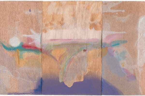
Despite his capacity for innovation, Tyler also continued to work in traditional techniques with a number of artists, among them the abstract painters Robert Motherwell and Helen Frankenthaler. Such painters, whose work is based on spontaneous gesture and who are always careful to point out they are 'artists', rather than 'printmakers' unduly concerned with craft, are among the most difficult people to print for because they have problems in reconciling the unique attributes of a work of art with uniform reproductive processes. Tyler's proven ability to serve both these artists is therefore a measure of the sensibility and tact that he, as a naturally impetuous man, has been able to develop over the years. He has learned the hard way that he must not invade the image making act, but must simply wait and do nothing until the artists are ready for him to print what they have drawn.
For Motherwell, Tyler has made a number of printed collage compositions, some of them on a grand scale, which, because of the pre-determined nature of their ready-made elements, present certain difficulties for an artist schooled in spontaneity. The prints composed simply of dramatic gestures made in lithographic ink are far less problematic. In fact, The stoneness of the stone, the first lithograph Tyler made for Motherwell in Bedford Village, proved particularly felicitous. Not yet set up for papermaking himself, Tyler had the happy idea of ordering two grey sheets to be laminated together so as to recapture exactly the image of the stone on which the artist had originally made his marks.
Motherwell hates the idea of creating to order and, because he lives very close to Tyler Graphics, he avoids the group situation that printmaking normally entails by working with Tyler at the weekends. His book illuminating a poem, El negro Motherwell, written in his honour by the Spanish poet Rafael Alberti, was made in this way.
Helen Frankenthaler's prints have been described as 'obstinately non-graphic'. Their cataloguer, Thomas Krens, suggests that her ambivalence about the techniques of printmaking may have prevented her from fully understanding the potential of graphic art.
Her characteristic but complicated working method is to fill seven or eight stones with marks, irrespective of the enormous difficulties this may present in grouping together the ones she wants in a suitable arrangement. Because Frankenthaler has wanted simply to draw spontaneously in ignorance of the processes involved, Tyler has learned to keep all mechnical functions around her to a minimum.
In 1977 however, she worked on the woodcut Essence mulberry at Tyler's workshop and at last departed from an excessive reliance on the kind of markmaking typical of painting. The result—which borrowed ideas from medieval woodcuts, the Japanese artist Hiroshige and the colour of the juice from a mulberry tree in Tyler’s garden— was a triumph. In this work, Tyler declared, Frankenthaler had decided that a print could be as good as a painting.
Recent work
Tyler's most recent work has included lithographs for David Hockney, based on a recent Mexican trip. The prints were made by means of an inventive method of colour separation drawn by the artist on plastic sheets. This allowed their transfer to lithographic plates with a minimum of fuss and delay and offered an immediacy and spontaneity unusual in colour printing. Tyler has also worked on large and richly coloured mixed media prints for the Minneapolis artist Steve Sorman. Sorman benefitted from techniques developed for the painter Frank Stella, who spent three years at Tyler Graphics, beginning in the early 1980s, and made two series there — the Circuits and the Swan engravings.
The works Stella and Tyler made during the period represent a high point in both their careers and were hailed as virtuoso prints transcending mere virtuosity. In their integrity and independence, they were said to have achieved a status comparable to painting and Clifford Ackley of the Boston Museum of Fine Arts added in a glowing review that they would have been 'impossible without the hightech wizardry and inventiveness of the printer'.
Stella had worked with Tyler at Gemini from 1967. His earliest prints were finely crayoned lithographs based on paintings, which showed various degrees of perceptible handling. In 1973, the crayoning became positively calligraphic in quality and Stella loosened up his drawing and began to use traditional methods that he had previously thought 'sissy-like'. In consequence, he became more and more involved with printmaking, particularly when he found that certain techniques were transferable to his metal relief paintings.
Stella identified three 'giant technical changes' that had helped liberate his printmaking. One was offset. He had wanted to use it at Gemini, but because of its association with mechanization and commercial printing, which cast it as an enemy of humanistic values, Tyler's partners had resisted its introduction. However, the transfer from a roller to a rubber blanket, which offset printing involves, sets down a very light layer of ink facilitating the superimposition of colour and rendering fine detail with great fidelity. Stella eventually used the process with another publisher and found that he could 'roll the ink over the paper the way I could brush paint over a surface'. In his new facility at Bedford Village Tyler was able to install a sophisticated offset press with which he editioned Stella's Exotic birds.
Stella's other technical discovery was the etching of magnesium which he used for both the series he made with Tyler in the 1980s. The printer thinks Stella's Swan engravings are 'as good as anything Durer ever did', while Stella felt they had 'the power of printing' and that achieving those results with a single impression of black ink on white paper was 'the ultimate thrill'. The third technical development was the multicoloured paper that Tyler created specially for Stella's complicated Circuit prints. By making sheets with varicoloured patches, Tyler was able to produce myriad hues by a single transparent inking.
Stella, who says Tyler taught him everything he knew about printmaking, can now be seen to have entered into a partnership with the printer that, as many commentators have recognized, represents a new kind of collaboration.
Tyler's achievement
Tyler knows he is what he is because of the artists he has worked with. He works all hours and seven days a week because he is essentially a maker in love with the activity he has chosen. He thinks being a printer is 'a terrific thing to be' and puts all his energy into his vocation. Although the high prices that the recent Stellas command has brought criticism and the accusation that his is 'a money press', work that engages a studio employing over a dozen people for three years represents a tremendous commitment of time and capital and constitutes a considerable risk. Only a painter with Stella's command of the market permits a collaboration of this magnitude to be undertaken.
Tyler's former teacher, Garo Antreasian, has commented that 'the lasting power to do this very difficult work is something that is of great significance'. For two decades now, Tyler has been balancing tradition and innovation, sound business practice and the risks of research and development, with considerable success. The artists who have been lucky enough to work with him realize they have participated in an intensity of collaboration rarely seen before and have paid him glowing tributes.
'I'm lucky. I believe the printers I've worked with are the very best. I know Ken thinks he's great, and he is! He loves the challenge.'
Hockney has found working with someone of Tyler's tremendous energy very thrilling and after the Paper pools project remarked that: 'With Ken Tyler nothing was impossible. If I said, could we, he said, yes, yes, it can be done.'
In September 1984, at the opening and dedication of a new building at the Walker Art Center in Minneapolis with a study facility devoted to Tyler's work, Robert Motherwell told the audience that the Sunday afternoons he regularly spends with the printer have been among the happiest of his life. Tyler, he said, was 'the greatest technical genius in America' — companionable and understanding, 'an artistic Don Juan' who seduced one with the miracle of printmaking.
Pat Gilmour, inaugural Head of the Department of International Prints and Illustrated Books, National Gallery of Australia



///national-gallery-of-australia/media/dd/images/20210604_James_Tylor_001.jpg)

