Word As Image
10 Mar 1989 – 4 Jun 1989

Bruce Nauman, Gemini G.E.L., Ronald McPherson, Jeffrey Wasserman, Robert Knisel, Ah ha, 1975, National Gallery of Australia, Kamberri/Canberra, Purchased 1976. © Bruce Nauman. ARS/Copyright Agency.
Exhibition Pamphlet Essay
The introduction of words and letters in art at the beginning of this century was one of the developments of the modern movement. In their push towards abstraction, artists of the avant-garde were concerned with expressing the formal properties of their pictures, such as line, colour and shape. As artists moved away from representing the external world, words and letters became appropriate subjects for art and contributed to the emergence of a distinctively twentieth-century iconography. This exhibition traces the development of the word as image as it is expressed in twentieth-century printmaking.
The years immediately prior to the First World War were a period of extraordinary artistic ferment among the avant-garde. By insisting upon the essential flatness of the picture space, Pablo Picasso and his fellow Cubist Georges Braque radically overthrew the illusionism of single-point perspective, which had been challenged since the late nineteenth century by Post-Impressionist artists such as Paul Gauguin, Paul Cézanne and Vincent van Gogh. The Cubists often celebrated the bohemian world of the café and bar by depicting in their still-lifes the names of their favourite wine or the titles of the newspapers they habitually read. Picasso, in his 1912 Cubist drypoint Still-life, bottle, refers to 'Marc', a well-known brand of spirits. The letters of the label also serve to define the spatial flatness of the picture. It was the poet Guillaume Apollinaire, a friend of Picasso and a staunch supporter of the Cubists, who devised the calligramme — a form of poetry wherein the words are arranged in a visual configuration suggestive of the subject. Apollinaire's calligrammes were widely influential among poets and artists keen to break down the boundaries dividing the visual from the literary. The Cubist Louis Marcoussis paid tribute to Apollinaire by etching his portrait; he chose to depict him with his head bandaged from injuries sustained during the war and surrounded by the titles of the works he had authored.
Almost simultaneously with the Cubist breakthrough, a group in Italy calling themselves the Futurists advocated the liberation of words from sentence structure and grammar. In a series of highly polemical manifestos issued from 1912, the leader of the Futurists, F.T. Marinetti, declared that henceforth words would no longer remain trapped by rules of grammar, punctuation or syntax. 'Words-in-freedom' became Marinetti's rousing battle cry. The dynamism of modern life was to be expressed through typefaces of wildly different weights and sizes. Speed and movement were now denoted by mathematical symbols, while the staccato repetition of letters would suggest the mechanical noise of a moving train, automobile or aeroplane. Many of the Futurists' typographical experiments were published in the pages of Lacerba, the Italian weekly newspaper that became an organ of the movement. Some of the most exaggerated expressions of the new typographic freedom were inspired by the chaos of the first world war. Explosions and the rattle of machine-gun fire are evoked typographically in Marinetti's depiction of a young woman lying on her bed reading a letter from her lover at the front.
Perhaps the most ambitious example of the fusion of word and image in the critical pre-war years is to be found in Sonia Delaunay's graphic masterpiece La Prose du Transsibérien et de la petite Jehanne de France. A key work of modernism, La Prose du Transsibérien was conceived as a collaboration between the Russian-born artist and the experimental poet Blaise Cendrars, both of whom were principal members of Orphism, a Paris-based movement from around 1912-14, that was concerned with expressing motion and rhythm through colour. This visually striking work has a most unusual format: four joined sheets of colour-stencilled and typographically printed paper fold out to form a narrow column measuring two metres in height and a third of a metre in width. The artist calculated that if all copies from the proposed edition of 150 were laid end to end, they would equal the height of the Eiffel Tower, a monument that symbolized the modern age to members of the Orphic group. Printed in twelve different typefaces and in several colours, Cendrars's long prose poem recounts the observations and reflections of a young poet as he experiences a seemingly endless train journey from Moscow across the wastelands of Siberia. A schematic Eiffel Tower at the base of the column evokes the poet's longing for cosmopolitan Paris as he travels to the furthest ends of the Russian Empire. Full of vibrant colour and rhythm, Delaunay's bold arcs, circles and geometric shapes provide a visual parallel to the text. By allowing the stencilled colours to spread across the areas of letterpress, Delaunay effectively unites text and image on the flat picture surface. Fernand Léger, another member of the Orphic group, also illustrated a prose text by Cendrars entitled The end of the world filmed by the angel N.-D. For one illustration, he devised a kaleidoscopic whorl of letters stencilled in brilliant colours. The artist's witty arrangement of the letters creates a formal pattern suggestive of the flicker of an early cinematic reel.
For the artists of the Russian Avant-garde in the decade between 1913 and 1923, words played an important part in their attempts to create a new pictorial art. Like the Italian Futurists, Russian artists such as Mikhail Larionov and Iliazd wanted to transcend the limits of conventional language. The Russian Avant-garde, however, did not share the Futurists' enthusiasm for picturing the sounds of modern life. Instead, they were engaged at a more theoretical level with investigating the very nature of language itself. Formulating a 'transrational' language called zaum, poets were concerned with the liberation of words from meaning by exploration of the basic sounds of language. These radical concepts were expressed by poets and artists in collaboration in small, illustrated books which were often constructed in a deliberately crude way. El Lissitzky's clever word-pictures, for example, were made from the letterpress obtainable in a typographer's case and served as illustrations to a collection of Vladimir Maiakovskii's poems called For the voice.
In Zurich during the First World War and in Paris immediately afterwards, typography was also inventively employed by the Dadaists, a group of artists who set out to create an anti-art by denying that art had any interest in principles. Rudely turning on its head, Tristan Tzara and his fellow Dadaists created absurd anti-art statements in the letterpress manifestos and flybills that announced Dada events such as nonsensical poetry readings and theatrical performances.
The verbal/visual experiments of the early twentieth century have been taken up by many leading artists on both sides of the Atlantic from the start of the 1 960s. This renewed interest in the word as image has taken diverse forms; alphabets, letters, puns, conundrums and word-games being among the most common. The revival may be seen in part as an outcome of Pop Art, which delighted in taking the slogans and labels of mass advertising and placing them in the context of high art.
Many American artists associated with Pop Art, notably Jasper Johns, Claes Oldenburg and Ed Ruscha, have consistently informs the work of Johns, who has often used the alphabet and numerals as his subjects. Sometimes the linear configurations of his superimposed letters are so complex that the artist produces an alphabetical maze in which one letter is indistinguishable from another. Oldenburg, even more than Johns, reveals his Pop Art origins: the letters melt and drip from his alphabet-cum-ice-cream bar, while in another work, the letter Q assumes the form of an enormous beach house, beneath which sails a miniature boat.
The West-Coast Americans Ed Ruscha and Bruce Nauman are two cunning visual wordsmiths, for whom the meaning of a word lies as much in its visual presence and power as in its literal associations. In the early 1970s, Ruscha produced a highly inventive group of prints which exploited the very processes of the lithographic technique in the creation of his word images. Lisp was made by splashing lithographic ink to the stone; the defective letters that resulted are an effective visualization of the idea. Nauman sometimes uses words which have the even effect to the of subverting the viewer’s perception of the image, even to the point where the viewer is insulted. Word games are another feature of Nauman's art: his Ah Ha is a palindrome (that is, it reads the same backwards as forwards) with the formal visual equivalent being the juxtaposition oi reversed images — one positive, the other negative in equal balance.
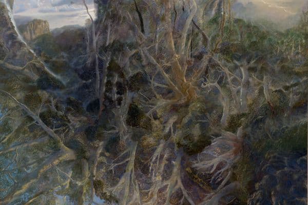
Artists in Britain have generally been more interested than their American counterparts in making visual statements from literary sources. Tom Phillips, R.B. Kitaj and Joe Tilson, in particular, have often developed their word images from literary texts. Phillips, who is obsessed with Dante's Inferno, has created a literal forest of words — suggestive of the poet's phrase Una selva oscura (a dark wood) overprinting the letters in dull ochres and deep greens. Kitaj is a bibliophile with an eye for unusual titles: the fifty screenprints from his series In our time were taken from the covers of books in his personal library and were intended as a kind of mini-history of twentieth-century political and social concerns. Tilson also uses his wide reading as a source for his word-pictures: the letter C from his A-Z box contains a pun on the ability to see — the embossed Braille text cites the opening words of James Joyce's Finnegans Wake, written when the Irish author himself was virtually blind.
The Concrete Poetry of the 1960s took up some of the ideas that Apollinaire was exploring in the early twentieth century, particularly the relationship between literal and visual meaning. The concrete poet Ian Hamilton Finlay has created a garden at Stonypath in Scotland of inscribed stones, rocks and slabs that testify to the visual power of words. His style is characterized by a reduction to essentials and a gentle harmony and order. The basis of Finlay's art is the interplay between literal and visual meaning; for example, the brilliant vermilion letters of his Acrobats literally leap and combine in a manner suggestive of gymnastic formations.
Some artists, like Jenny Holzer and Hans Haacke, use words to express a moral or political message. Holzer's outrageous essays were intended to be read on the walls of New York bus stations and subways rather than on those of a museum. Aggressive, denunciatory and inflammatory, Holzer's tracts express with savage irony the extreme views of those whom society has pushed to the edge. For Haacke, the statements published in company reports are used as a means of seriously questioning the motives of business involvement in politics and art.
The connection between words and images in twentieth-century art remains a powerful theme. Artists and writers have often collaborated to create works in which the word and image work together. By making words and letters an integral part of their imagery, artists have created a new aesthetic dimension in which our traditional preconceptions of the respective functions of words and images are challenged.
Stephen Coppel
